Segment Analytics
Last updated: June 30, 2026
What are Segment Analytics?
Segment Analytics gives you a detailed view of how your customer base is structured and how it develops over time. It breaks down your customers into meaningful segments so you can understand who is buying, how often they return products, whether they are subscribing, and how active your overall customer base is.
It also helps you understand the overall size of your customer base and how it is distributed across the different customer segments. This makes it easy to identify which customer groups make up the largest share of your business, how their size changes over time, and identify opportunities for optimization.
With Mable 2.1, Segment Analytics is available for four areas:
Overview
Acquisition
Returns
Subscriptions
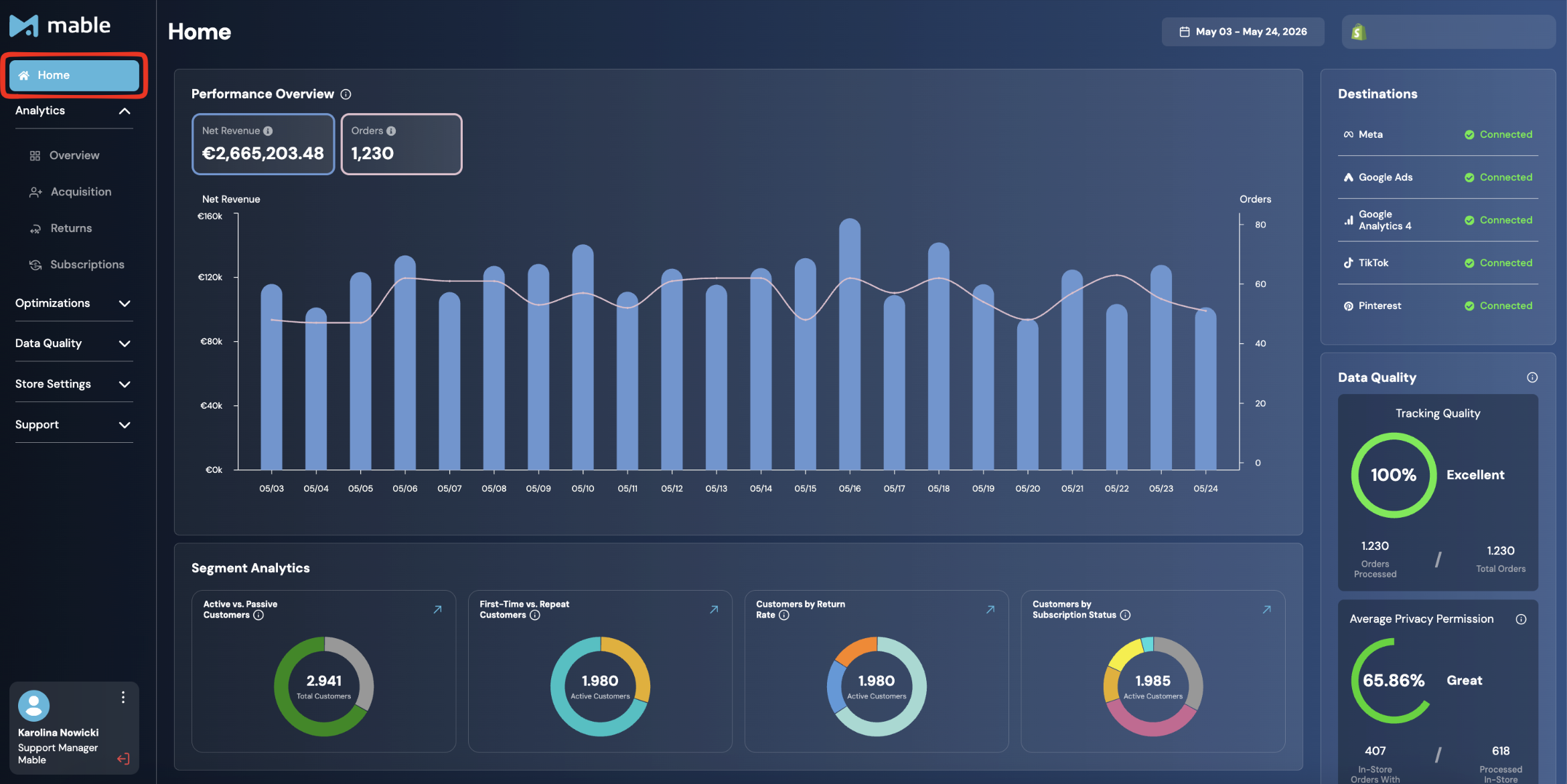
A compact version is also visible on the Home Screen.
Where can you find the different analytics? What can you see?
Overview Segment Analytics
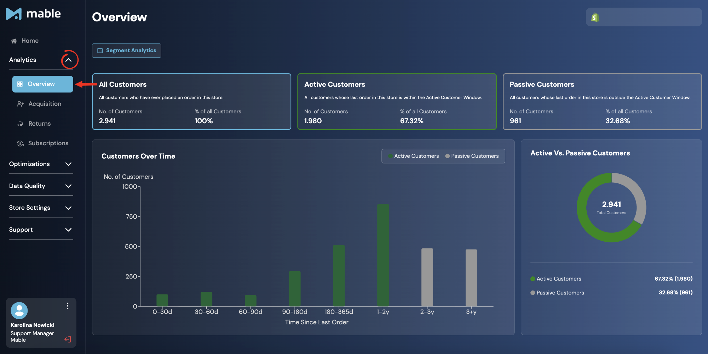
The Overview Segment Analytics gives you a high-level picture of your entire customer base and how it splits between active and passive customers.
Where to find it
Go to: Analytics → Overview
How is Overview Segment Analytics structured?
At the top, you see three cards:
All Customers: All customers who have ever placed an order in your store.
Active Customers: Customers whose last order is within your defined Active Customer Window.
Passive Customers: Customers whose last order is outside the Active Customer Window. They have bought before but are no longer considered active.
Each card shows the total number of customers in that group, their percentage of all customers, the number of customers with a privacy permission, and the percentage with privacy permission. The privacy permission number is relevant because only customers with a valid permission can be used in Mable Audiences.
Customers Over Time
The bar chart shows how your customers are distributed based on how long ago they last placed an order, from 0–30 days up to 3 years or more. Bars are split into Active Customers (green) and Passive Customers (grey).
The primary purpose of this chart is to help you choose the right Active Customer Window. By visualizing how recently your customers have purchased, you can estimate how changing the Active Customer Window would affect the size of your Active Customers segment and, consequently, most other customer segments and Audiences.
For example, if many customers are clustered around the current boundary, extending or shortening the Active Customer Window can significantly change the size of your Active Customer segment. The histogram helps you understand these effects before adjusting the setting and choose a timeframe that best matches your business.
Active vs. Passive Customers
The donut chart summarizes the split between Active and Passive as a percentage of your total customer base.
Acquisition: Segment Analytics
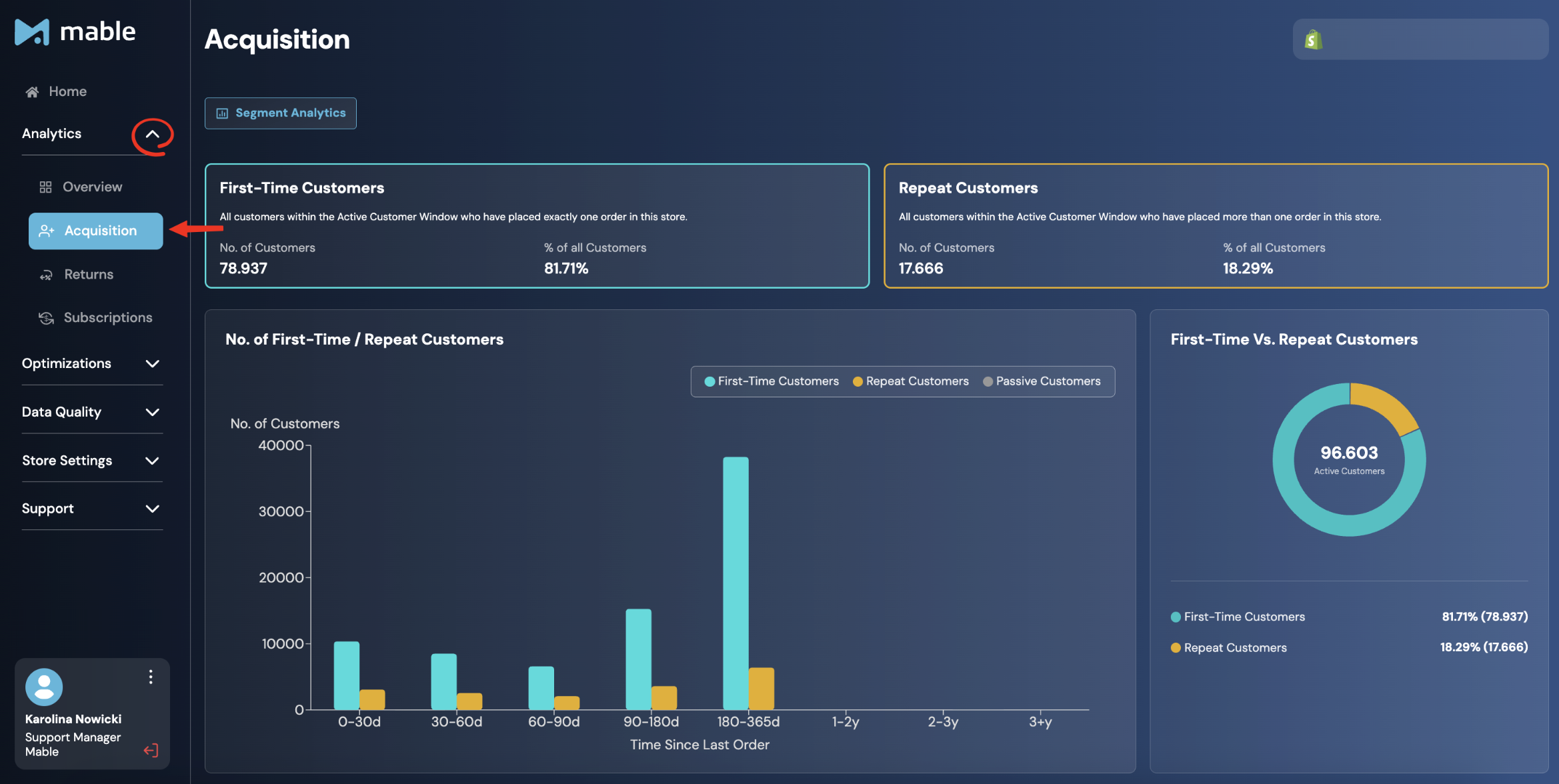
The Acquisition Segment Analytics shows how your customer base is split between First-time Customers and Repeat Customers.
It helps you understand whether your active customer base is mainly driven by first-time buyers or by customers who have purchased before.
Where to find it:
Go to: Analytics → Acquisition
How is Acquisition Segment Analytics structured?
At the top, you see two summary cards:
First-Time Customers: Customers who have placed an order in your store for the first time.
Repeat Customers: Customers who have made more than one purchase in your store.
Each card shows:
number of customers
percentage of all active customers
No. of First-Time / Repeat Customers chart
The No. of First-Time / Repeat Customers chart shows how First-Time Customers, Repeat Customers, and Passive Customers are distributed by Time Since Last Order.
This helps you understand how recently each customer group purchased and whether your active customer base is mainly driven by first-time buyers or repeat buyers.
The chart uses time buckets such as 0–30 days, 30–60 days, 90–180 days, 1–2 years, and 3+ years.
First-Time vs. Repeat Customers
The First-Time vs. Repeat Customers donut chart summarizes the split between First-Time Customers and Repeat Customers across your Active Customers.
The number in the center represents the total number of Active Customers included in this view.
Returns Segment Analytics
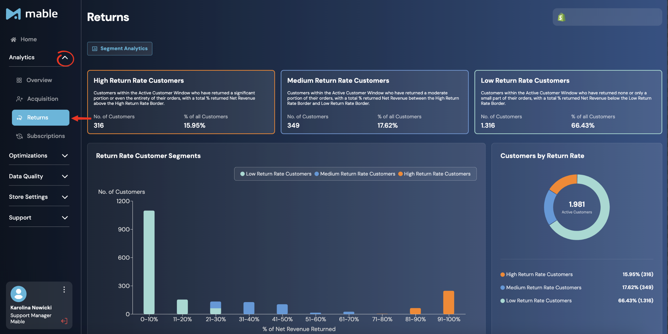
The Returns Segment Analytics section shows how your active customers are distributed across return rate segments. This helps you identify what share of your customers drives returns.
Where to find it:
Go to: Analytics → Returns
How is the Returns: Segment Analytics structured?
At the top you will see three cards:
High Return Rate Customers: Customers within the Active Customer Window who have returned a significant portion or even the entirety of their orders, with a total % returned Net Revenue above the High Return Rate Border.
Medium Return Rate Customers: Customers within the Active Customer Window who have returned a moderate portion of their orders, with a total % returned Net Revenue between the High Return Rate Border and Low Return Rate Border.
Low Return Rate Customers: Customers within the Active Customer Window who have returned none or only a small part of their orders, with a total % returned Net Revenue below the Low Return Rate Border.
Each card shows the number of customers in that segment, their percentage of all customers.
The thresholds that define these segments can be adjusted in the Segment Settings. Read more about it in the guide Segments Screen.
Return Rate Customer Segments Chart
The bar chart shows how customers are distributed across return rate ranges, from 0–10% up to 91–100% of net revenue returned.
Each bar is color-coded to indicate the segment the customers belong to based on your current Return Rate Segment Borders:
Light blue: Low Return Rate Customers
Blue: Medium Return Rate Customers
Orange: High Return Rate Customers
The primary purpose of this chart is to help you choose appropriate Return Rate Segment Borders. By visualizing how your customers are distributed across different return rates, you can identify natural breakpoints and estimate how changing the borders would affect the size of each return rate segment.
This allows you to tailor the segmentation to your brand's actual return behavior instead of relying on arbitrary threshold values.
Customers by Return Rate
The donut chart summarizes the percentage split between High, Medium, and Low Return Rate customers across your active customer base.
Subscriptions Segment Analytics
The Subscriptions Segment Analytics section shows how your subscription customers develop over time. It gives you visibility into what share of your customer base purchases through a subscription model and how that group is growing or churning.
Where to find it:
Go to: Analytics → Subscriptions
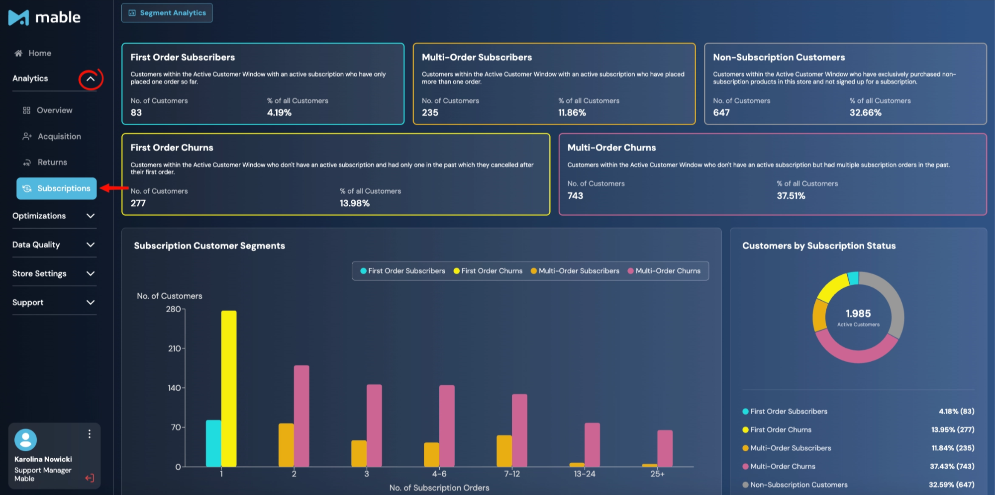
How is the Subscriptions Segment Analytics structured?
At the top, you will see five subscription segment cards:
First Order Subscribers: Customers within the Active Customer Window with an active subscription who have only placed one order so far.
Multi-Order Subscribers: Customers within the Active Customer Window with an active subscription who have placed more than one order.
Non-Subscription Customers: Customers within the Active Customer Window who have exclusively purchased non-subscription products in this store and not signed up for a subscription.
First Order Churns: Customers within the Active Customer Window who don’t have an active subscription and had only one in the past which they cancelled after their first order.
Multi-Order Churns: Customers within the Active Customer Window who don’t have an active subscription but had multiple subscription orders in the past.
Each card shows:
number of customers
percentage of all customers
Subscription Customer Segments chart
The Subscription Customer Segments chart shows how subscription-related customer groups are distributed by the number of subscription orders.
This helps you see whether subscription customers usually stay for only one order, continue for multiple orders, or churn after a certain number of subscription orders.
The chart includes:
First Order Subscribers
Multi-Order Subscribers
First Order Churns
Multi-Order Churns
The x-axis groups customers by number of subscription orders, for example 1, 2, 3, 4–6, 7–12, 13–24, and 25+.
Customers by Subscription Status
The Customers by Subscription Status donut chart summarizes the split between subscription-related segments across your active customers.
It shows how many customers are:
First Order Subscribers
Multi-Order Subscribers
Non-Subscription Customers
First Order Churns
Multi-Order Churns
The number in the center represents the total number of Active Customers included in this view.
This gives you a quick overview of whether your active customer base is mainly made up of subscription customers, churned subscription customers, or non-subscription customers.
Segment Analytics on the Home Screen
A compact version of your Segment Analytics is visible directly on the Home Screen. Without navigating into the full Analytics section, you can see a quick snapshot of your most important segment numbers for your store at a glance.